
Developer-Centric UI
Design that prioritises clarity, efficiency, and ease of use for developers.
Structured Layout
Ensured a precise, organised design for fast information delivery and navigation.
Visual Support System
Integrated custom icons and illustrations to enhance readability and UX.

Intro
Collaborating with Console9 was an incredible opportunity to contribute to a cutting-edge platform that redefines monitoring solutions for modern web applications and critical infrastructure.
/ INTRO
/ HERO ANIMATION
PROJECT OVERVIEW
Challenges & Needs
The Console9 team faced the challenge of creating both an app and a website from scratch to showcase and support their innovative monitoring solution. They required a design that catered specifically to developers, offering a tech-oriented and functional interface without unnecessary distractions. The app needed to deliver a user-friendly experience for developers while maintaining a sleek, professional aesthetic, a task that required both creative and technical expertise.
The goal was to design a seamless experience for developers by combining functionality with modern aesthetics. Working closely with the Console9 team, we conducted research to understand the unique needs of coders, ensuring that every design decision aligned with usability and performance.
By balancing simplicity and visual appeal, we designed an app that makes monitoring web and app activity efficient and straightforward. The accompanying website was tailored to highlight the app’s capabilities, presenting it in a clear, engaging, and accessible way.
Duration & Process
The project spanned three months, encompassing in-depth research, visual identity development, and the creation of the app and website. We began by analysing the provided wireframes and refining the structure to align with the target audience’s expectations. From there, we designed and iterated on every element, focusing on usability and aesthetics.
Frequent communication and constructive feedback from the Console9 team played a pivotal role in achieving a polished result. The outcome is a cohesive, intuitive platform that merges practicality with style.
CREDITS

/ VISUAL IDENTITY
Console9’s visual identity was designed to meet the needs of developers, combining functionality and aesthetics. We chose JetBrains Mono for its coding-friendly monospaced design and Fira Sans for a modern balance. A dark mode theme was chosen to reduce eye strain and create a sleek, developer-friendly interface, with light blue accents adding vibrancy and focus to key elements. This streamlined design reflects Console9’s innovative and tech-driven nature.




/ SCREENS
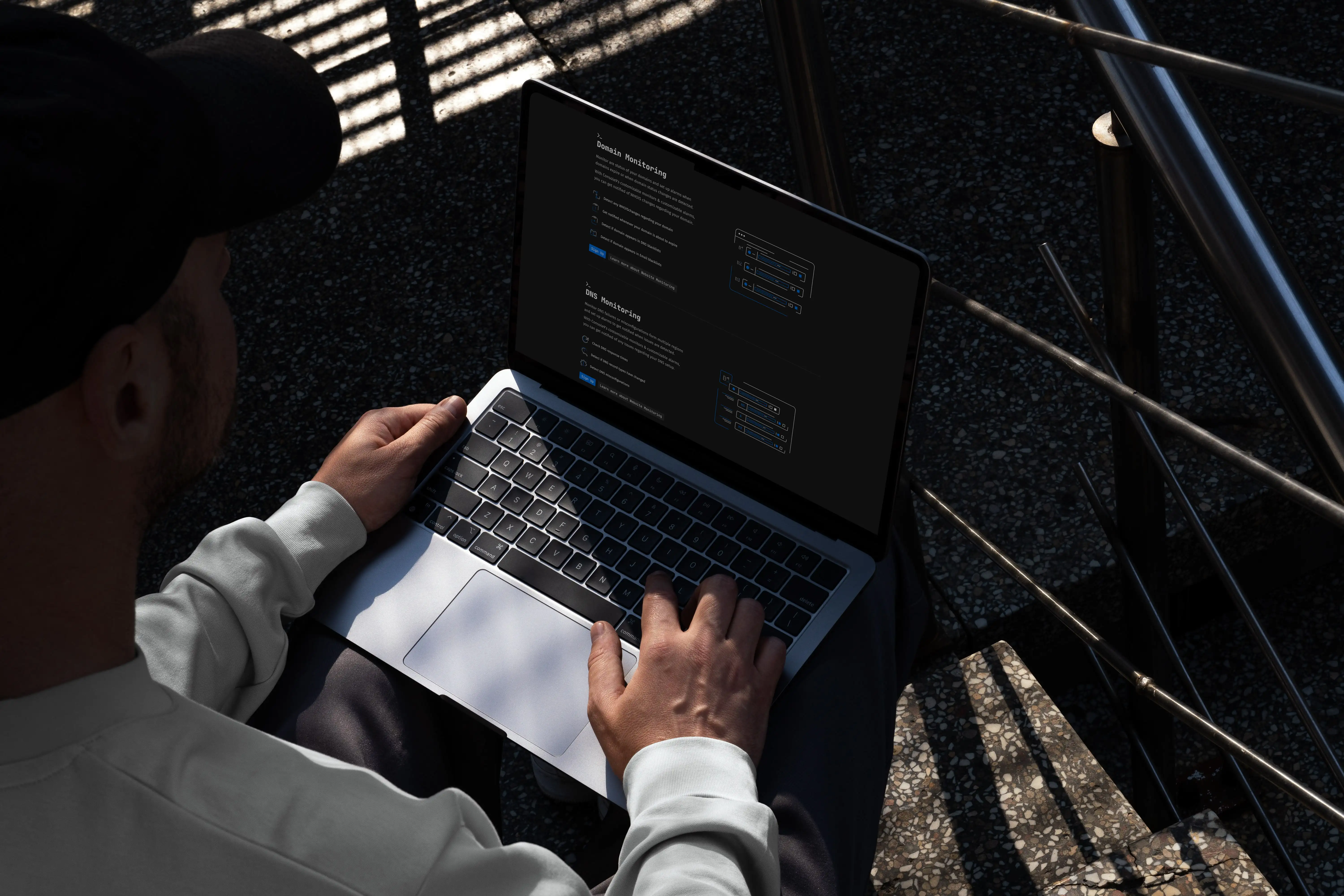
The design of Console9 is based on a grid system that ensures every screen layout is precise, allowing for fast and efficient information delivery. The dark mode interface minimises visual fatigue, so developers can focus on the task at hand. Custom icons and specialised illustrations support the content, breaking down technical information into digestible visual elements.
Every page is carefully structured to present detailed solutions in a way that is both visually appealing and instantly usable, making the app and website not just functional, but a pleasure to navigate.


/ GRAPHIC ELEMENTS
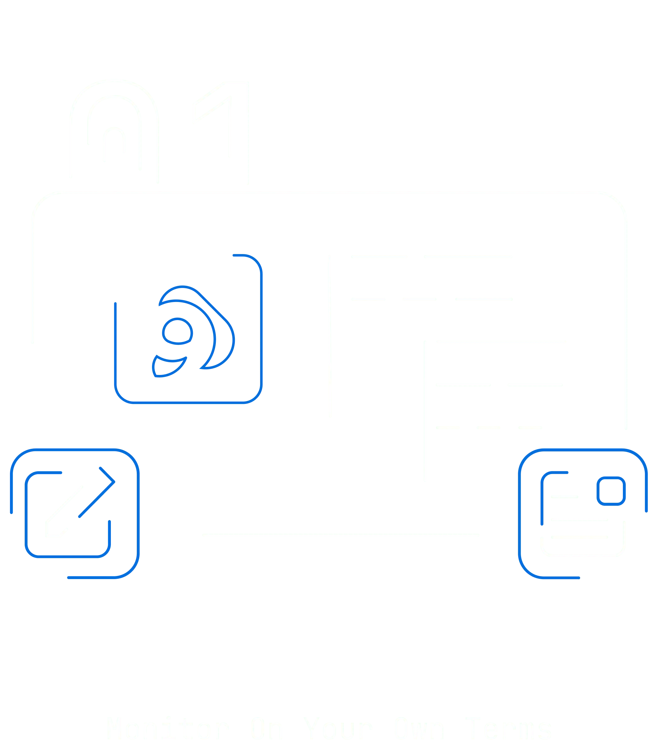
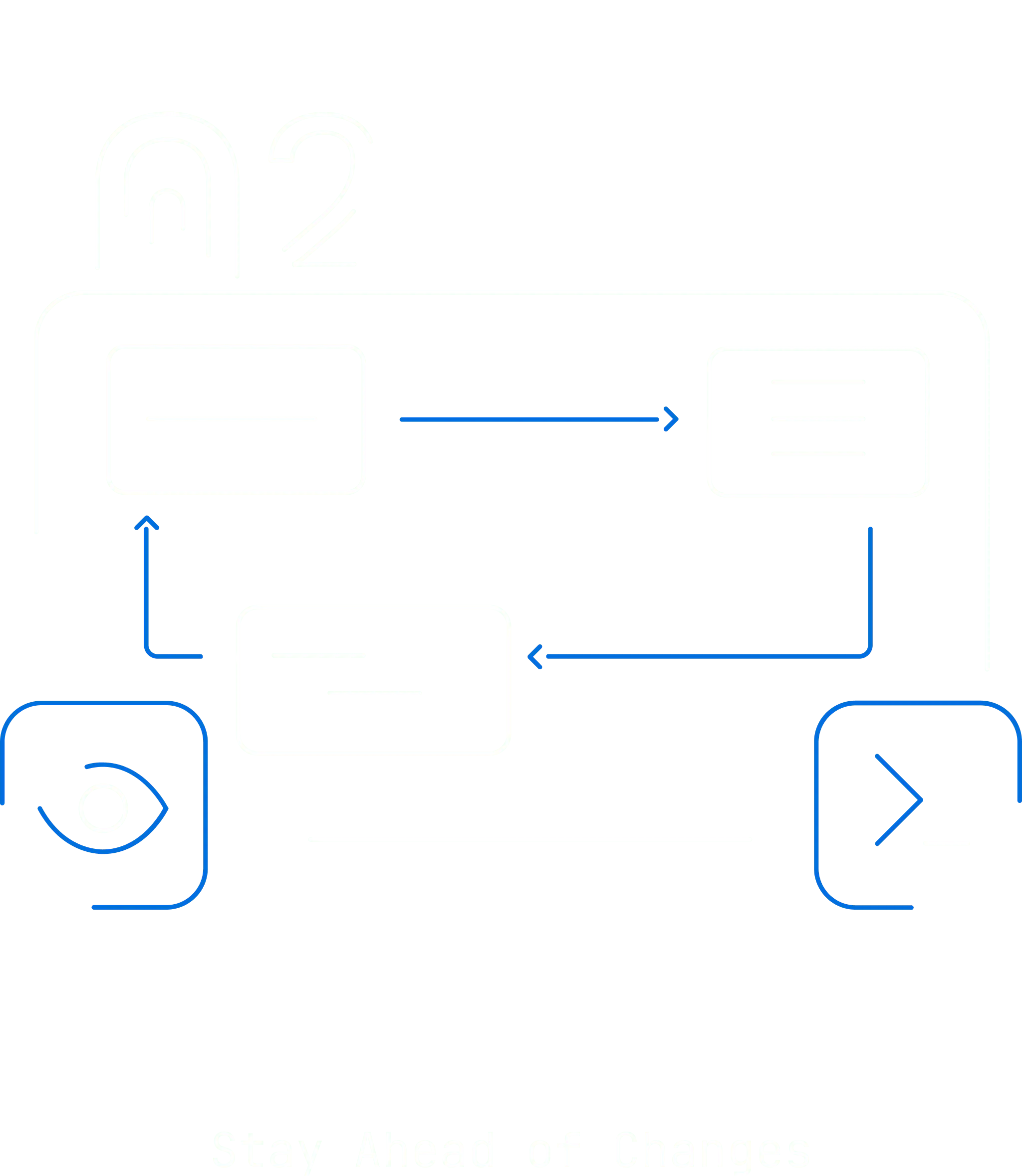
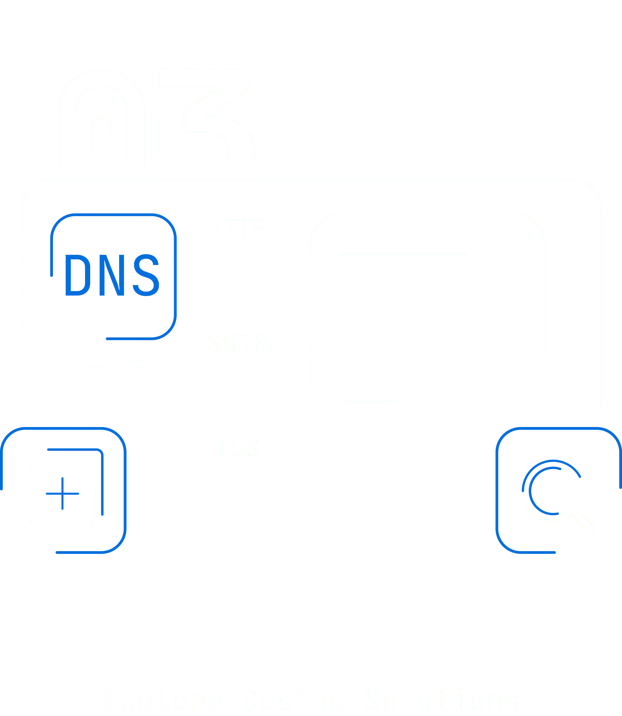
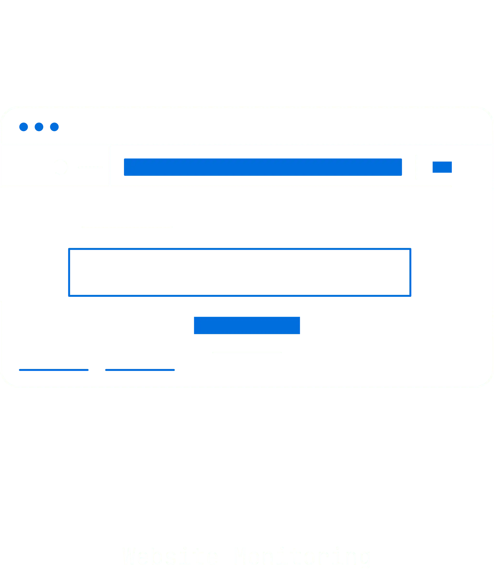
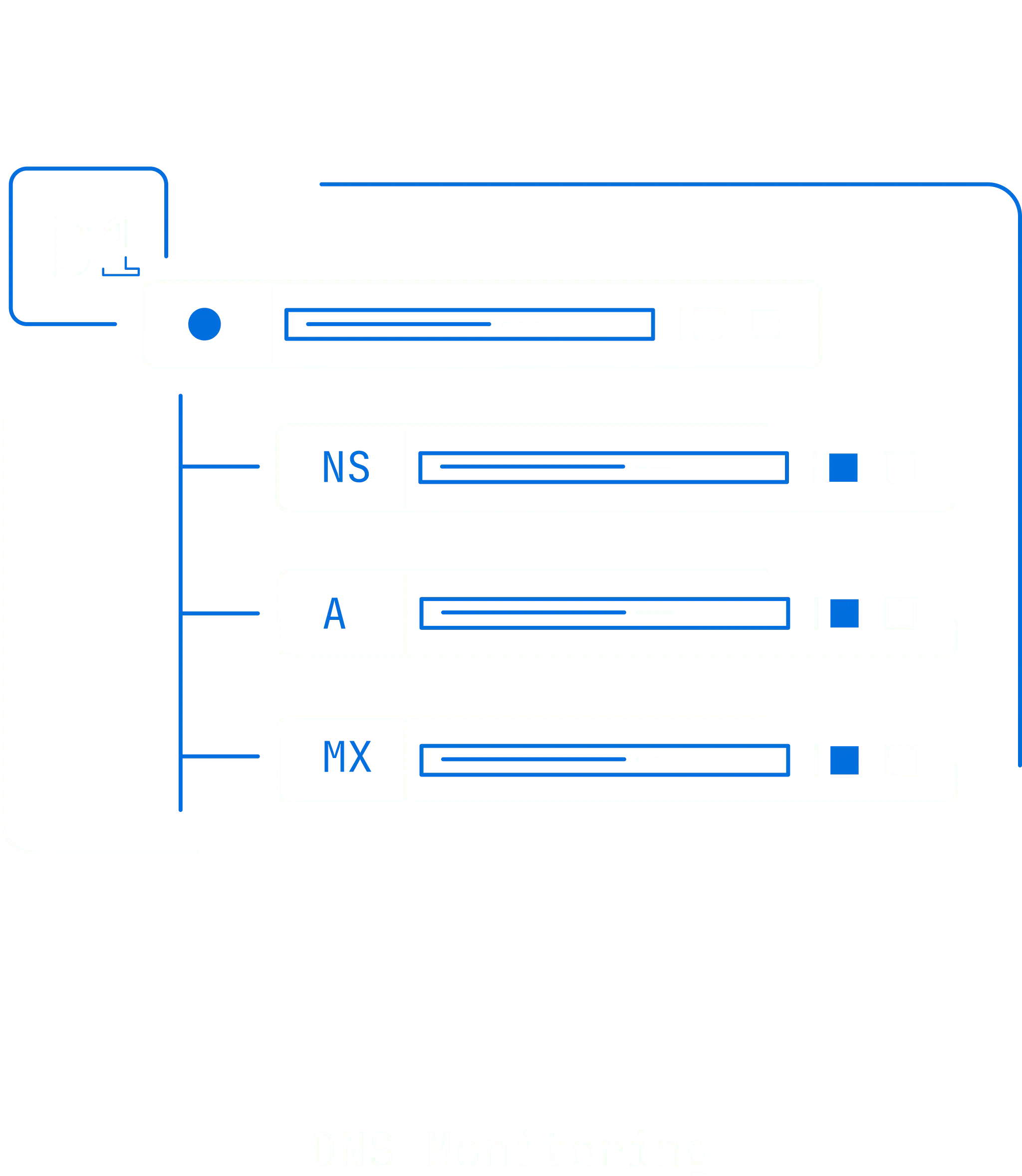
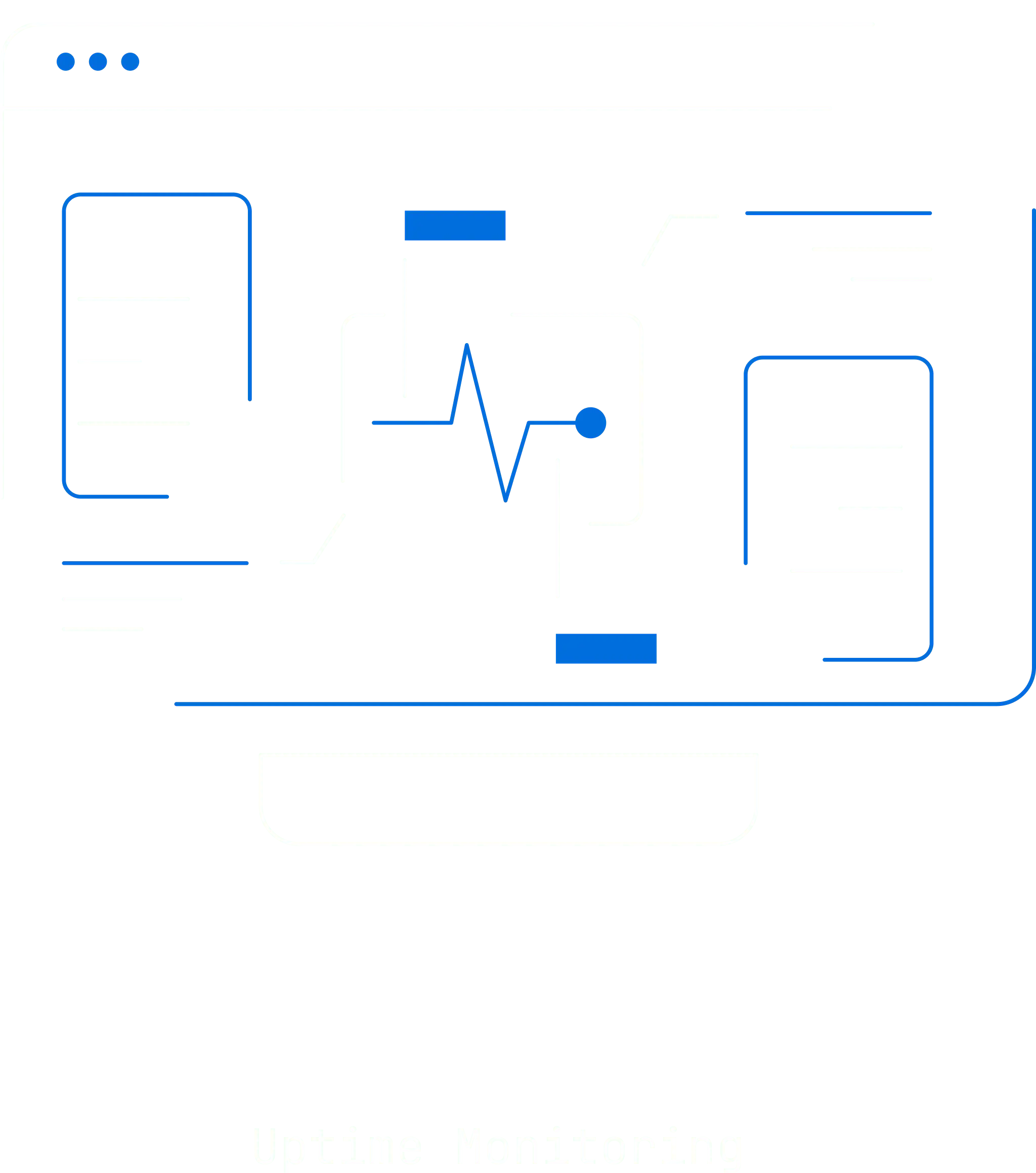
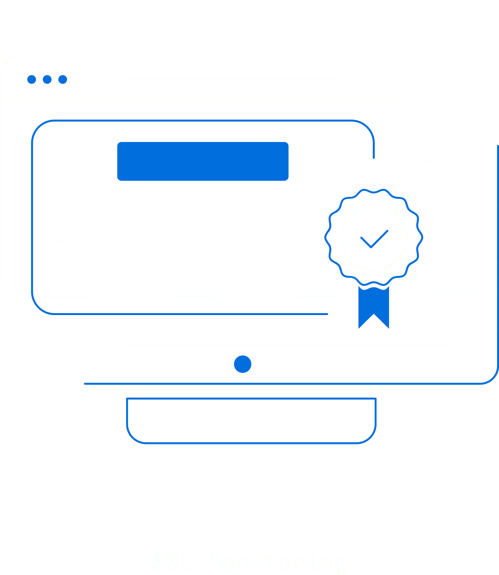
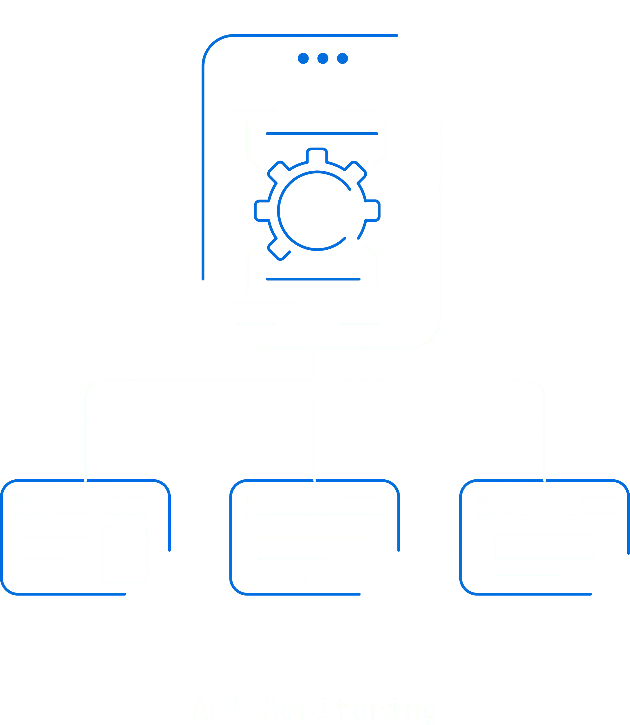
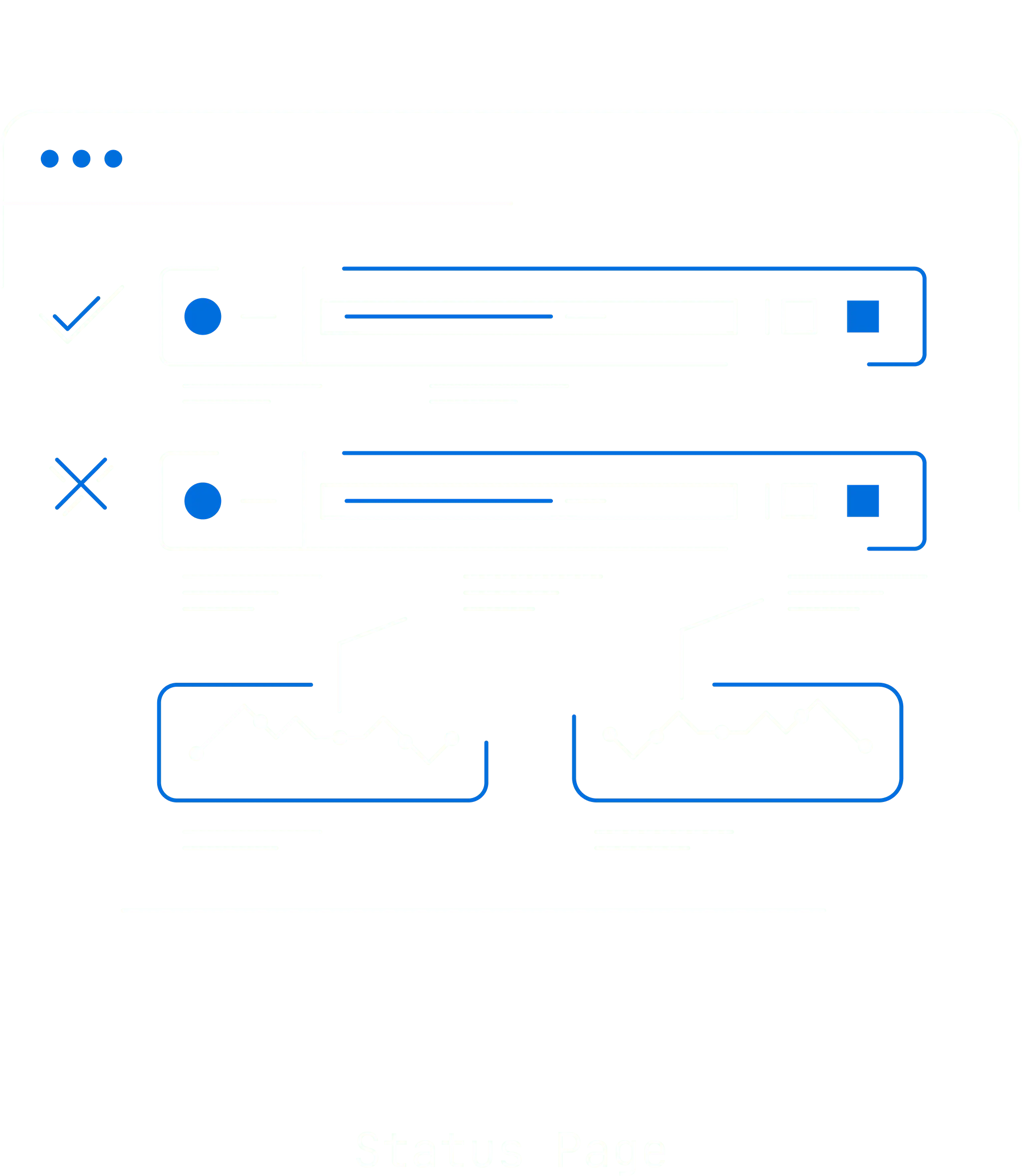
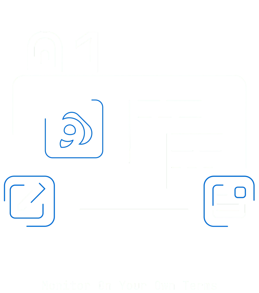
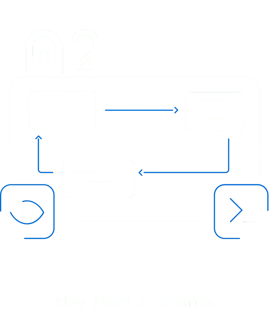
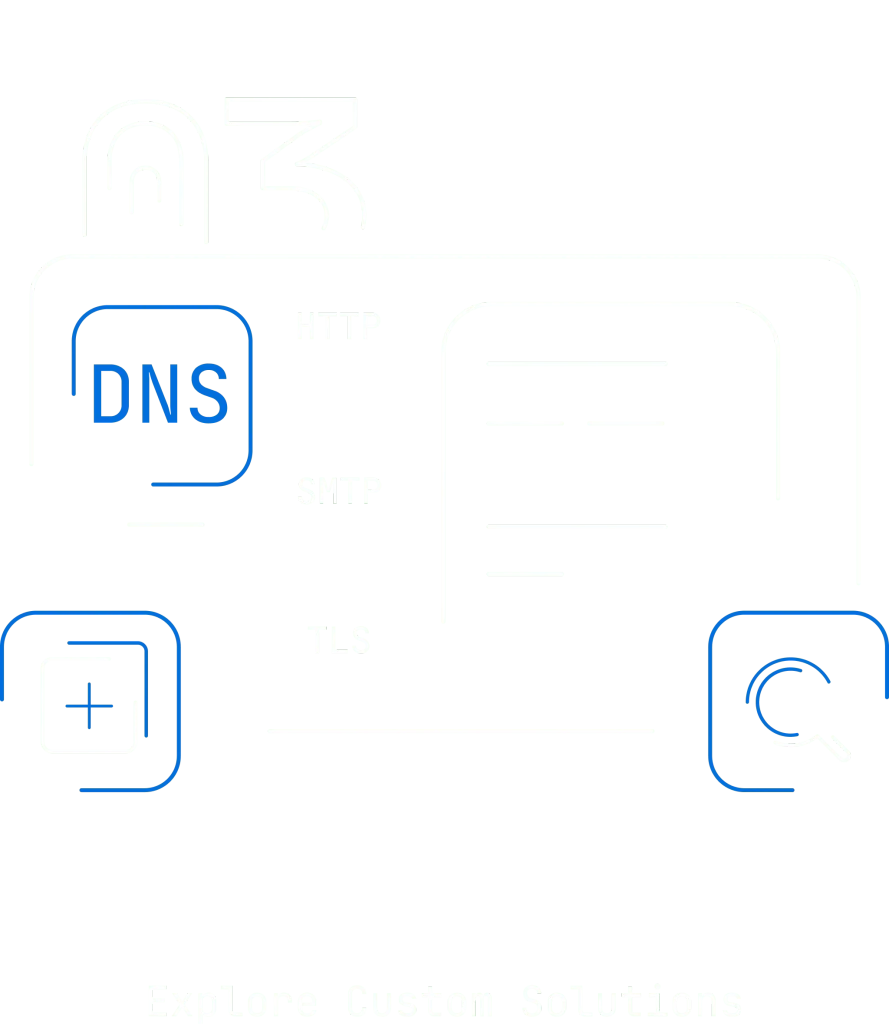
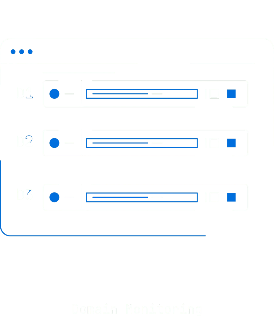
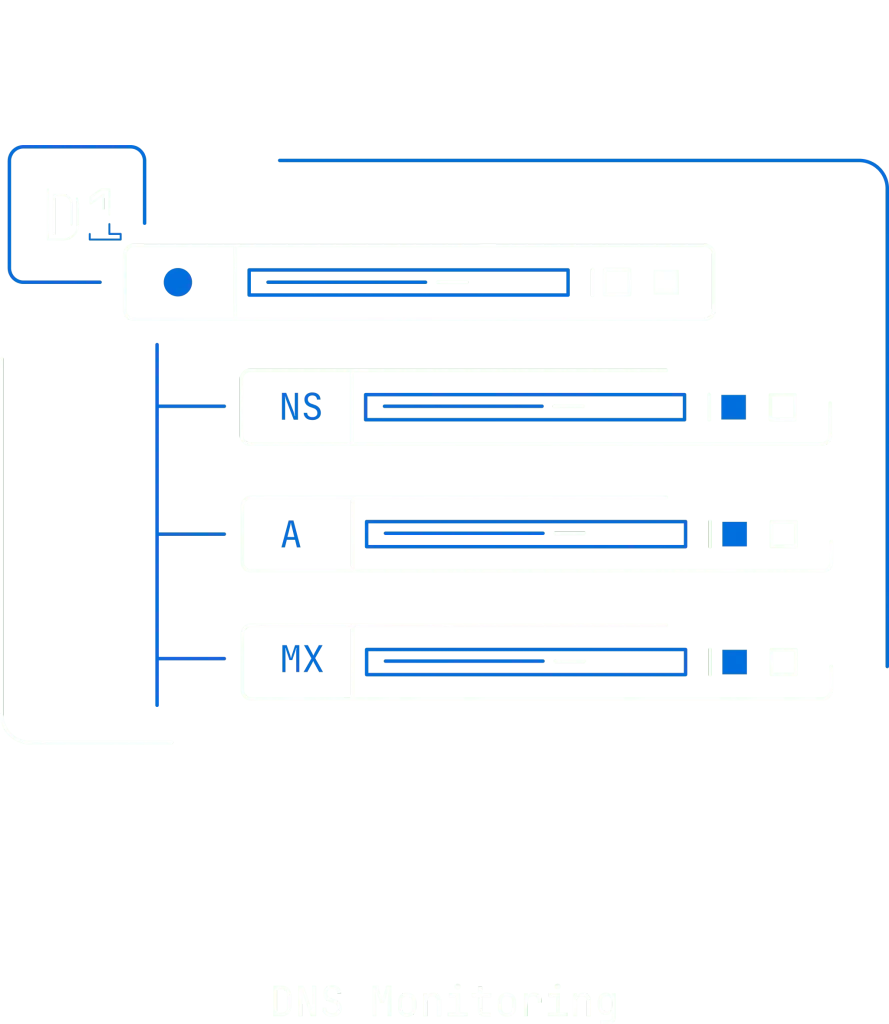
We created a set of 70+ high-impact icons for web and app, designed for clarity and bold visual presence. The white and blue colour combination align with Console9’s tech aesthetic. Alongside these, we also designed a series of illustrations in the same clean and cohesive style, enhancing the brand’s visual identity.
/ ICONOGRAPHY






/ DIGITAL ILLUSTRATION




/ CONCLUSION
In conclusion, Console9 proves that clear, well-considered design can boost technical performance. The grid-based layout, dark mode, and custom visuals ensure every screen delivers complex information quickly and accurately. This project shows that smart design choices make a technical platform both effective and engaging for developers.