
Expanded the Audience
Rebranded to feel welcoming for all skill levels, not just experienced bikers.
Playful & Energetic Logo
Designed a bold, vibrant visual identity with eye-catching elements.
Locally-Inspired Colours
A colour palette reflecting the park’s local identity and outdoor spirit.

Intro
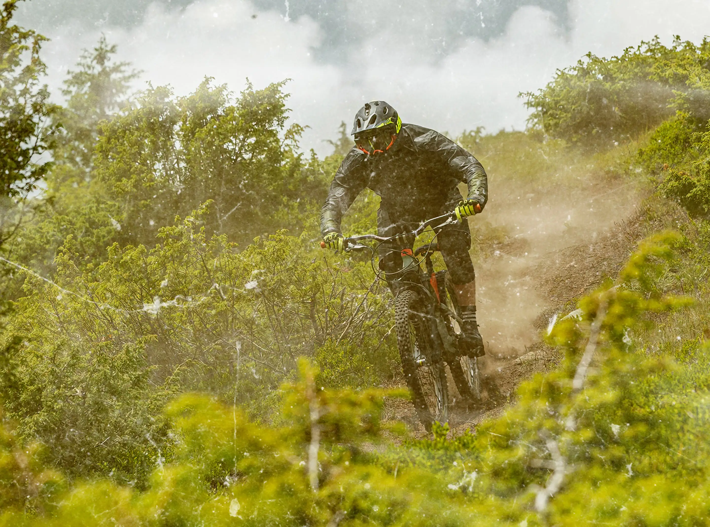
weRIDE is an amazing bike park developed out of a passion for nature, tourism and sport. The trails are located in the mountain resort of Muntele Mic and its surroundings, the mountainous area of Caras-Severin county, in Romania. The wRIDE team’s goal was to present the incredible beauty of this area, seen from the free-ride trails at Muntele Mic.
PROJECT OVERVIEW
Challenges & Needs
weRIDE park faces the challenge of catering to a diverse audience, as its trails range in style and difficulty, attracting both seasoned riders seeking thrilling experiences and families looking for approachable outdoor activities. This duality demands a cohesive brand identity that balances adventure with accessibility to appeal to its varied user base.
We developed a colourful, family-friendly visual identity for the brand, ensuring it appeals to all visitors. The logo reflects this inclusivity with vibrant colours and dynamic elements, symbolising the park's varied offerings and welcoming atmosphere. This design strikes a balance between adventure and accessibility, effectively representing the diverse experiences available at weRIDE park.
Duration & Process
The project spanned three weeks, starting with extensive sketching and concept development. To fully immerse ourselves in the weRIDE experience, we visited the bike park at Muntele Mic, soaking in its atmosphere and gaining firsthand inspiration for the project.
With insights from our visit and great input from the weRIDE team, we refined the logo, designed a vibrant colour palette to make the park more inviting, and incorporated key elements like trees, mountains, and a helmet, symbolising both thrill and safety. We also created catchy messages for stickers and trail signage, adding a fun and motivational touch to the rider experience in the park.
CREDITS
weRIDE Team
We extend our thanks to the weRIDE team for their trust and collaboration. A special shoutout for inviting us to Muntele Mic, experiencing the park firsthand was truly inspiring. Together, we shaped a visual identity that captures the energy, adventure, and inclusivity of weRIDE’s spirit and community.
/ VISUAL IDENTITY
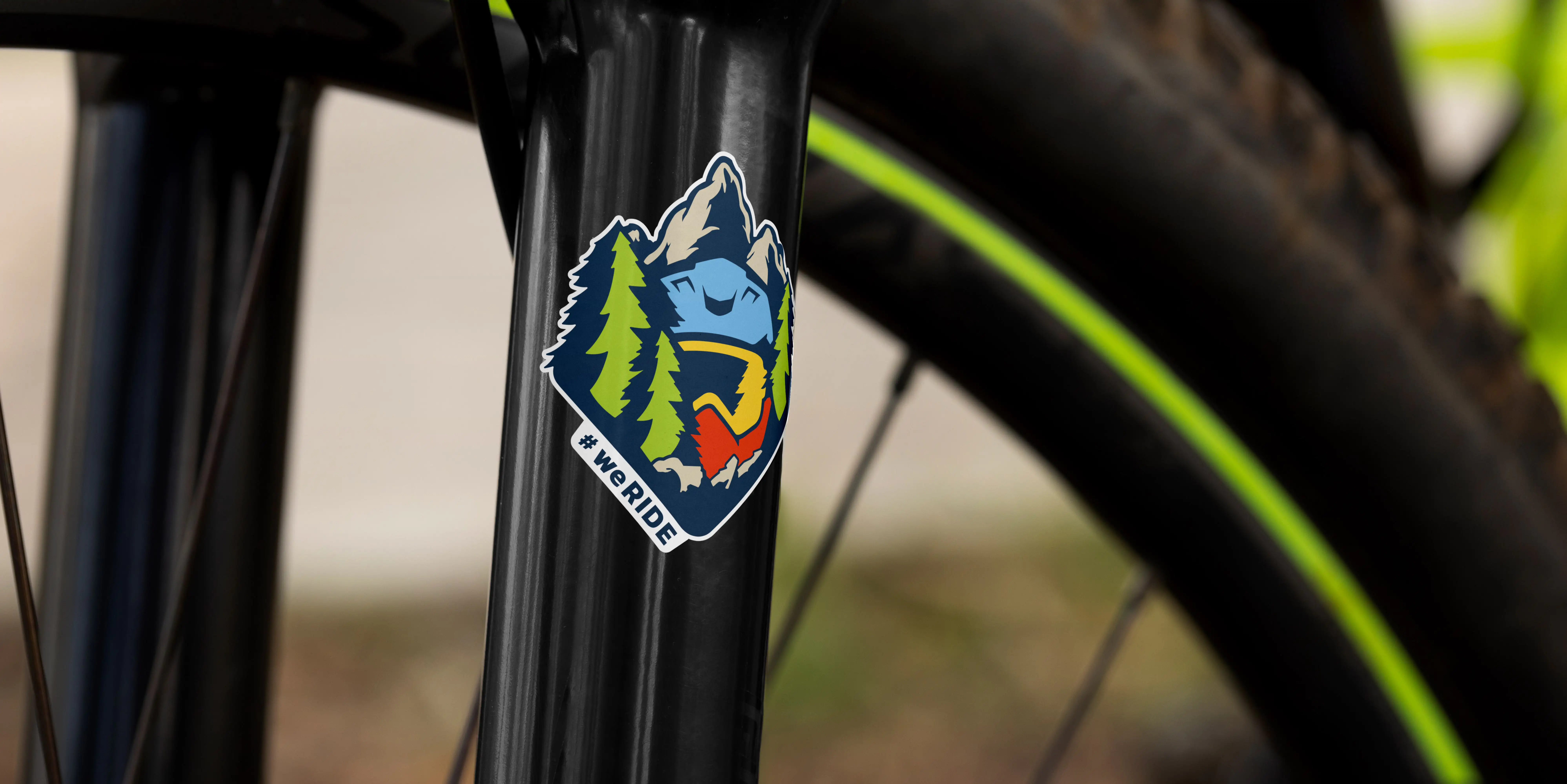
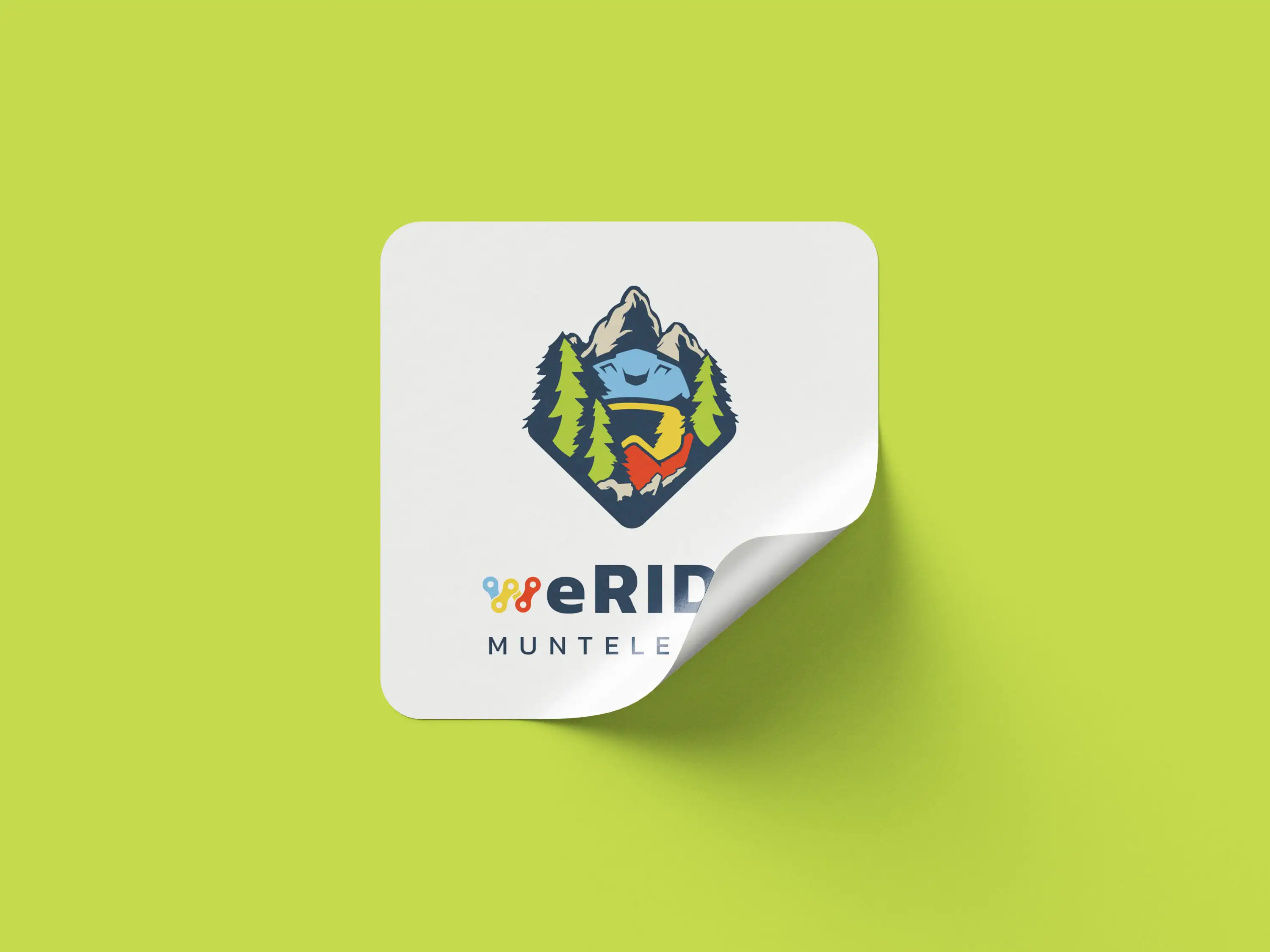
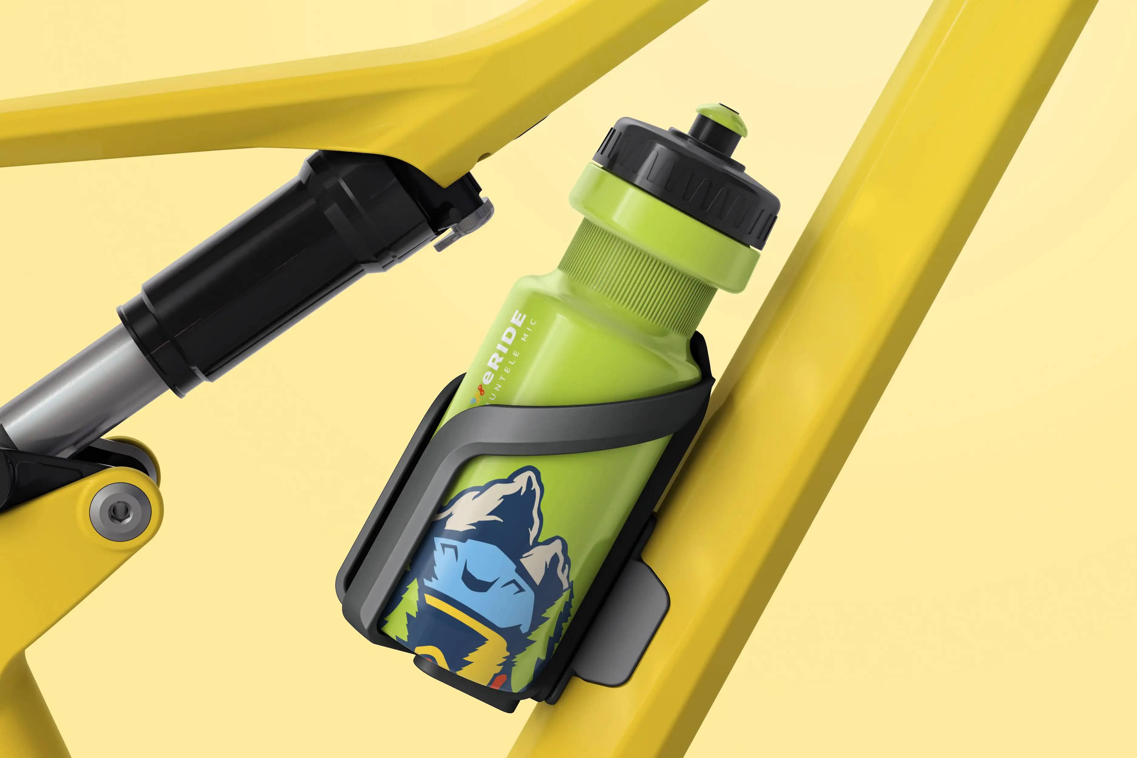
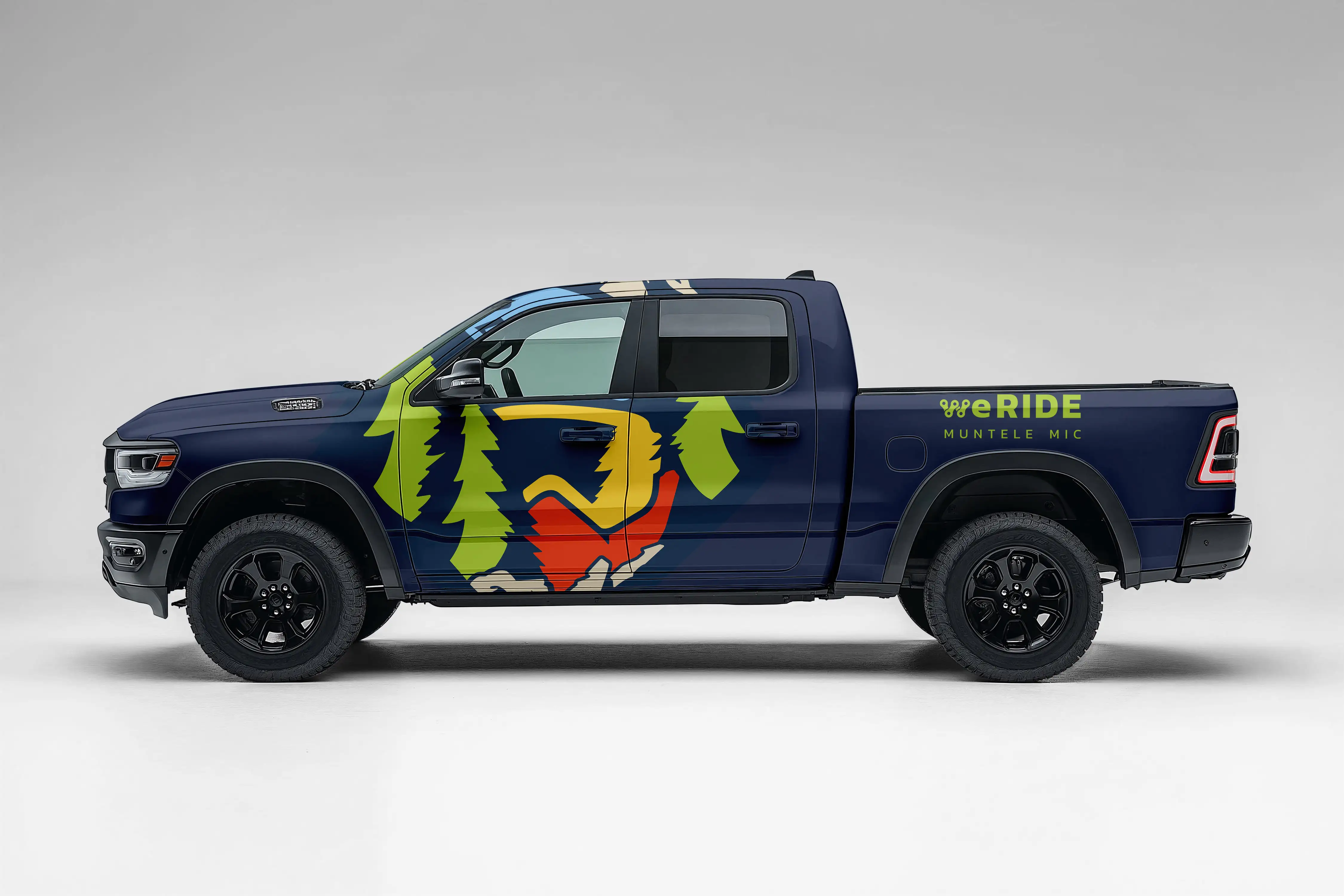
We created the weRIDE logo to embody the park’s adventurous spirit and welcoming vibe. At its core is a stylised mountain biker’s helmet, symbolising both the thrill of riding and a commitment to safety. Surrounding it are bold mountain peaks and evergreen trees, reflecting the scenic terrain of Muntele Mic and reinforcing a sense of exploration.
The interplay of rugged outlines and smoother curves highlights weRIDE’s inclusive approach, catering to both seasoned riders and families. Meanwhile, the vibrant colour palette conveys excitement while keeping the design approachable. To further strengthen the brand’s visual continuity, the “W” in weRIDE is uniquely formed from bicycle chain links, serving as a distinctive mark that endures even in the absence of the full emblem.




/ COLOURS
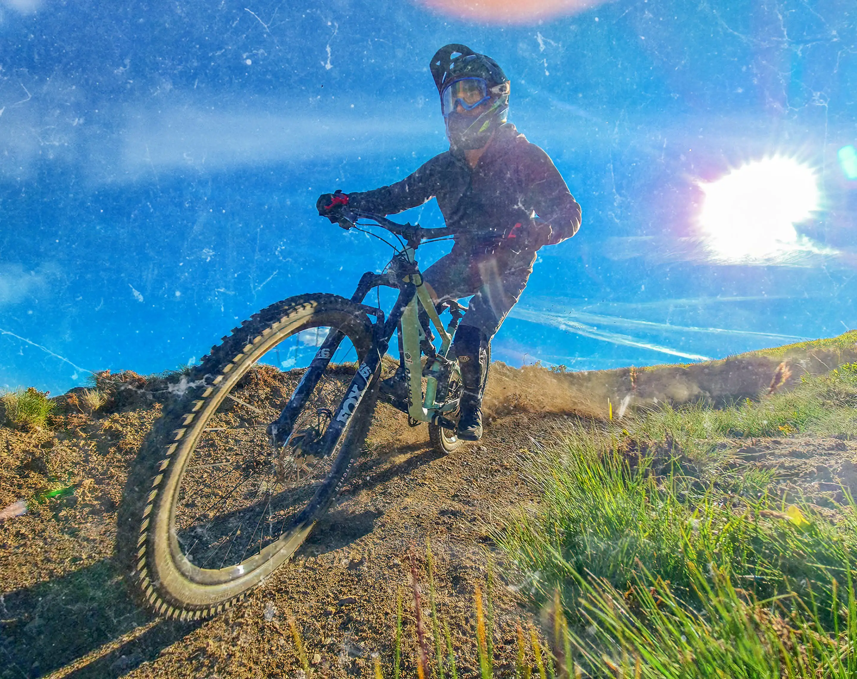
Our thoughtfully curated colour palette embodies weRIDE’s dynamic energy and pays homage to its natural environment. Inspired by the organic tones of the local landscape alongside a modern take on Romanian flag colours, the palette combines bold intensity with an inviting, accessible feel. This balance reinforces weRIDE’s vision as a park for all, making the park a destination for everyone, from seasoned pros to beginners, families, and children.


/ GRAPHIC ELEMENTS
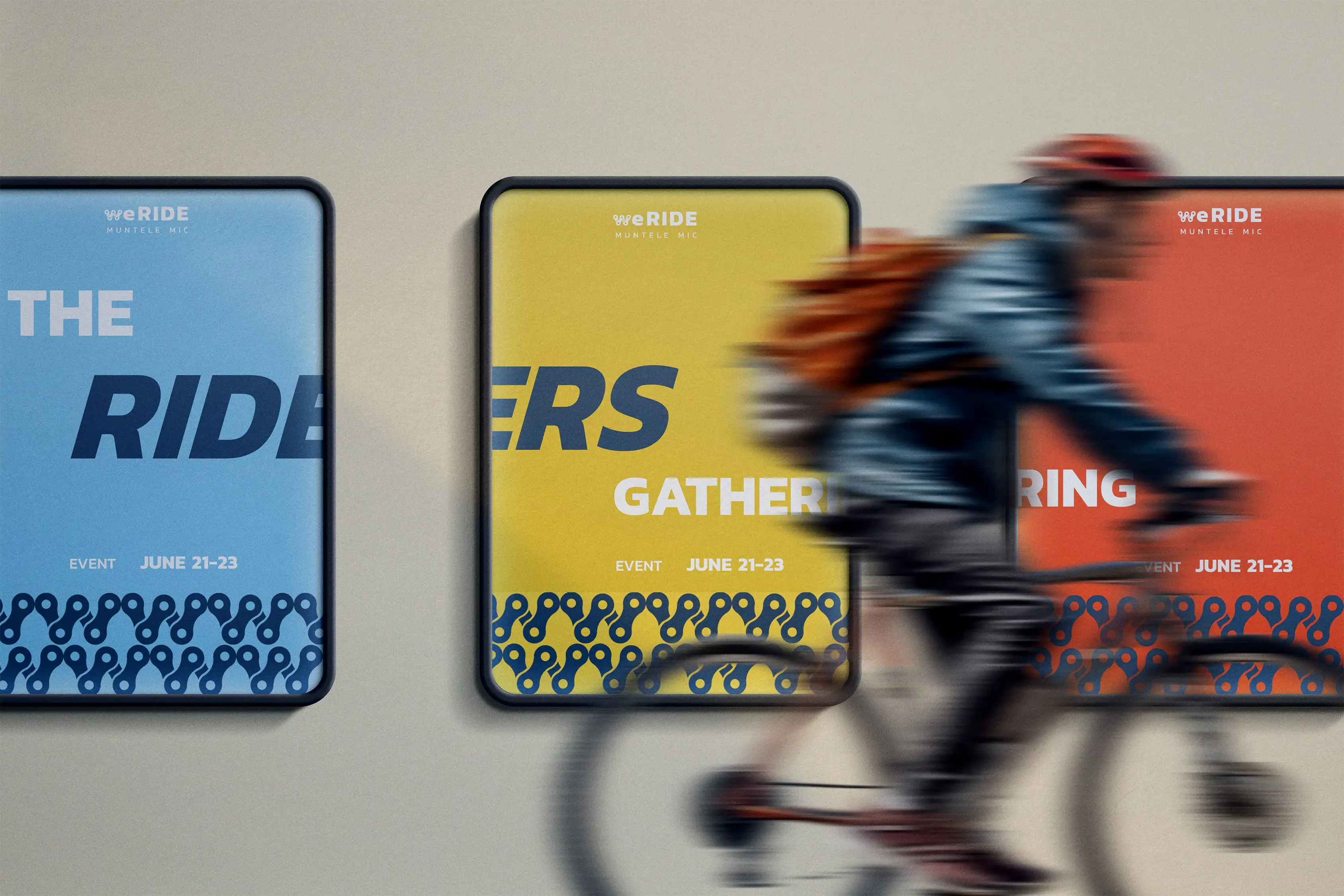
We created a set of fun and functional signage elements to enhance the rider experience. A rest area symbol provides clear wayfinding, while playful messages like “Ride Like a Cyclopath” and “Pedal It Out, Baby” add a touch of humor and motivation along the trails.



/ CONCLUSION
We transformed weRIDE into a brand that speaks to both thrill-seekers and families alike. The vibrant logo, playful graphics, and immersive brand elements create a dynamic yet approachable experience, perfectly aligning with the park’s diverse trails. Our design not only enhances brand recognition but also fosters a sense of excitement and community. With this strong foundation, weRIDE is now positioned as more than just a park—it’s a destination where every rider, regardless of skill level, feels welcomed and inspired to ride.